The Royal Geographical Society (with IBG) has selected our museum mapping work as notable geo-visualisations!
Andrea Ballatore, Lecturer in Social and Cultural Informatics at King’s College London, and Fiona Candlin, Director of the Mapping Museums research project, were interested in understanding the spatial unevenness of the cultural sector by studying the location of museums in relation to where people live across the UK.
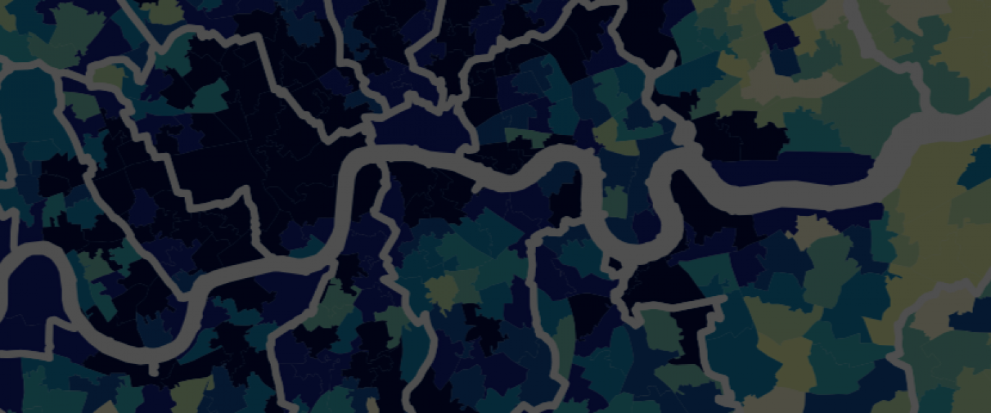
What story does this visualisation tell, and why was it created?
The visualisations created show huge geographical inequalities in the sector, with some areas attracting a lot of museums and others very few. To do this we started by creating two figures. Figure 1 is a classic choropleth map showing the number of museums per 100,000 people, with a corresponding cartogram showing the local authority districts. The choropleth map (left) gives a recognisable geographical representation of the data which is easy for the reader to recognise. In comparison, the cartogram (right) shows administrative regions, which although loses the topographical accuracy, gives a better sense of the centres and peripheries of museum distribution.

See 🌎 https://www.rgs.org/about-us/what-is-geography/geovisualisation/mapping-museums
